University of Cambridge
University of Cambridge: Maths and Sports: Olympic Records
Can you work out which Olympics athletics event each anonymised graph of Olympic records data represents? This activity, aimed at Key Stage 3 (age 11-14), gives students the opportunity to make sense of graphical data and challenges them...
Khan Academy
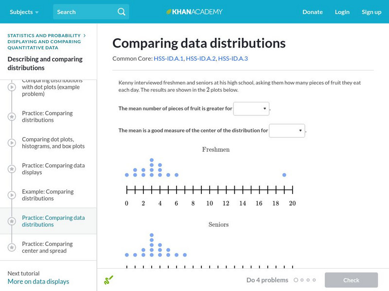
Khan Academy: Comparing Data Distributions
Take a look at two different data distributions and draw some comparisons. Students receive immediate feedback and have the opportunity to try questions repeatedly, watch a video or receive hints.
Illustrative Mathematics
Illustrative Mathematics: 7.sp.3,4 Offensive Linemen
College football teams are grouped with similar teams into "divisions" (and in some cases, "subdivisions") based on many factors such as game attendance, level of competition, athletic department resources, and so on. Schools from the...
Illustrative Mathematics
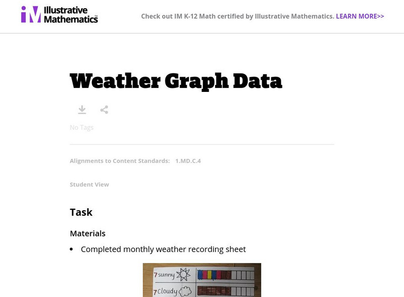
Illustrative Mathematics: Weather Graph Data
The purpose of this task is for students to represent and interpret weather data, as well as answer questions about the data they have recorded. Student worksheets and recording sheet are included.
Alabama Learning Exchange
Alex: Questioning Nasa
In this lesson plan students will work collaboratively to explore the "Big Question" that led up to this lesson plan was "Why are there two solid rocket boosters used to launch the space shuttle instead of one with the same amount of...
Better Lesson
Better Lesson: Describing Data Activity
This is a hands on activity to get the students thinking about how to describe data sets.
Better Lesson
Better Lesson: Line Plot Activity
This lesson will tap into US History and the ages of presidents during their inauguration and describing the data in a line plot.
Better Lesson
Better Lesson: Say It With Stats! Review
The students will be working in centers to review for their test. The centers will consist of a computer rotation, versa-tiles, and a teacher center. All centers will reinforce concepts learned throughout this unit to prepare them for...
Better Lesson
Better Lesson: Misleading Leading Graphs
Through the use of real life data, the students will be looking at a variety of graphs to decide if they are displaying misguided information.
PBS
Pbs Kids: Curious George: Hat Grab
This Curious George game teaches children data analysis and graphing. Grab hats as people pass by so that George can graph the collected hats. Then answer a question about the hats!
Better Lesson
Better Lesson: Comparing the Weather
In order to meet Common Core standards, 2nd graders need to be able to interpret data to solve problems. This instructional activity provides practice in this area. Included in this instructional activity are a printable temperature...
Khan Academy
Khan Academy: Data Inferences Harder Example
This video resource from Khan Academy provides practice questions for the SAT Math. Watch Sal work through a harder Data inferences problem. We make a confidence interval by starting with a sample result and adding and subtracting the...
PBS
Pbs: Count on It!: Blossom and Snappy Go to the Post Office
Blossom and Snappy help Digit mail a surprise package to Robbie. They visit the post office and postal processing plant to see how it all works.
ArtsNow
Arts Now Learning: Dance Graphs [Pdf]
Second graders will interpret data on graphs and then use the information to explore dance composition and the form and order of created choreography.
E-learning for Kids
E Learning for Kids: Math: Tea Store: Reading a Table
Students will demonstrate how to interpret information in a table.
McREL International
Mc Rel: Whelmer #64 Learning Activity: Liquid Rainbow
An easy to do activity that investigates density and solubility. The activity is presented in lesson plan format that meets NSES standards.
Math Slice
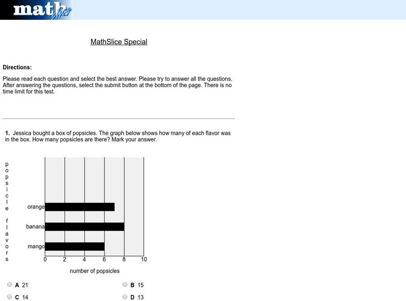
Math Slice: Chart Slice Special Test
A ten question test assessing data collection and analysis skills with bar graphs. Assessment is scored online. An excellent tool for assessment.
PBS
Pbs Mathline: Whirlybirds [Pdf]
This engaging lesson combines the concepts of statistics and measurement. Learners create a simulation of a parachute jump using whirlybirds, to predict the frequency of an event occurring. A detailed lesson plan which includes a list of...
English Zone
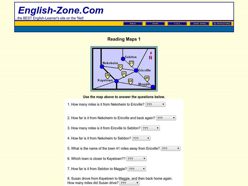
English Zone: Reading Maps 1
Using the map provided, students are to answer questions such as how far is it from one town to another.
Other
Family Chronicle: Dating Old Photographs
Family Chronicle provides information concerning photos from the 1850s-1900s. Details the background around the first photographs taken in the United States. Identifies what objects within the photograph can help determine the time...
US Department of Education
National Center for Education Statistics: Nces Classroom
Just what is the NCES Students' Classroom? In addition to many useful features, this site provides math and statistical activities tailored to a middle and elementary school students.
ClassFlow
Class Flow: Thanksgiving Graphing
[Free Registration/Login Required] Students will interpret data from a bar graph and a pictograph. They will then create one of each on the Activboard. This flipchart includes links to websites and an Activote quiz.
ClassFlow
Class Flow: Graphing Graphs
[Free Registration/Login Required] Standard: Constructs and Interprets simple bar graphs and pictographs with up to 5 columns using whole unit data.
ClassFlow
Class Flow: Interpreting Tables and Graphs
[Free Registration/Login Required] Explore a variety of graphs and tables. Many activities are incorporated to provide practice solving problems using different graphs and charts.


