Illustrative Mathematics
Puzzle Times
Give your mathematicians this set of data and have them create a dot plot, then find mean and median. They are asked to question the values of the mean and median and decide why they are not equal. Have learners write their answers or...
EngageNY
Differences Due to Random Assignment Alone
It takes a lot of planning to achieve a random result! Learners compare results of random assignment, and conclude that random assignment allows results to be attributed to chance. They also realize the set of random means are clustered...
Chymist
Ink Analysis: An Experiment in Paper Chromatography
Test differences in writing instruments with this hands-on activity to demonstrate paper chromatography in action. The class performs an experiment on multiple writing instruments and determines the area of separation to discover an...
Cornell University
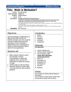
Math Is Malleable?
Learn about polymers while playing with shrinky dinks. Young scholars create a shrinky dink design, bake it, and then record the area, volume, and thickness over time. They model the data using a graph and highlight the key features of...
EngageNY
Sampling Variability in the Sample Proportion (part 1)
Increase your sample and increase your accuracy! Scholars complete an activity that compares sample size to variability in results. Learners realize that the greater the sample size, the smaller the range in the distribution of sample...
Discovery Education
Mood Music!
Grouchy? Sad? Here's a great resource that shows kids how music can be used to lift their spirits. Kids collect and chart data on the effects of music on emotions. After analyzing the results of their experiment, they develop their own...
Centers for Disease Control and Prevention
Solve the Outbreak
Pretend to be an Epidemic Intelligence Service officer for the Centers for Disease Control and Prevention. Detectives deal with data and make decisions to determine the dawn of the disease!
Curated OER
comparison of Two Gender Sports Teams
Students gather data on sports team and create a box and whisper plot. In this data collection lesson plan, students find the median, the quartile range, and relationships between variables.
Curated OER
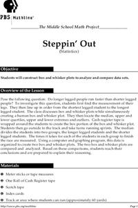
Steppin' Out
Students are presented with the question: "Do longer legged people run faster than shorter legged people?" Students conduct an experiment, collect their data, create box and whisker plots using a computer and graphing program, and...
Curated OER
Mean, Median, & Mode
Pupils determine mean, median, and mode. In this problem solving instructional activity, students evaluate a set of data to determine the mean, median, and mode. Pupils work in small groups practicing cooperative learning skills as they...
Curated OER
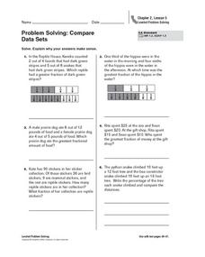
Problem Solving: Compare Data Sets
There are a variety of techniques students can use to compare fractions. In this instructional activity on fractions, 5th graders are shown a way to create a visual comparison and asked to solve word problems. Students are encouraged to...
Curated OER
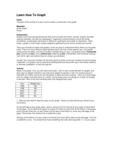
Learn How to Graph
Students examine various types of charts and discover how to construct a line graph. Using graph paper, they construct a graph displaying weight loss over a five-year period. They draw copnclusions from the completed graphs.
Curated OER
Choosing the Best Graph
In this mathematics worksheet, 6th graders use a line graph to illustrate how a measure of data changes and explain their reasoning. Then they use a bar graph to compare pieces of data and a pictograph to compare data.
Curated OER
Exploring the USA and the World with Cartograms
Middle schoolers investigate cartograms in order to explore the different countries on Earth. In this world geography lesson plan, students use the Internet to analyze data on different cartograms. Middle schoolers compare data, such as...
Curated OER
Misleading Graphs
Students explore number relationships by participating in a data collection activity. In this statistics lesson, students participate in a role-play activitiy in which they own a scrap material storefront that must replenish its stock....
Curated OER
What is a Box and Whisker Plot?
Eighth graders explore the correct use of box and whisker plors. The times when they are appropriate to use to compare data is covered. They plot data according to statistical analysis including mean, median, and mode.
Curated OER
Seized Before Flights: Graph
In this bar graph worksheet, students analyze a graph that show the number of prohibited items intercepted at U.S. airport screening checkpoints. Students answer 3 problem solving questions about the data on the graph.
Curated OER
My Peanut Butter is Better Than Yours!
Students explore the concept of statistical data. In this statistical data lesson plan, students read an article about the dangers of peanut butter to those who are allergic. Students perform a taste test of two different brands of...
Curated OER
Give Me a Minute
Students categorize data. In this categories lesson, students get a specific topic and they have a minute to list as many items that fit under this topic. They compare lists with a classmate and discuss whether all answers work.
Inside Mathematics
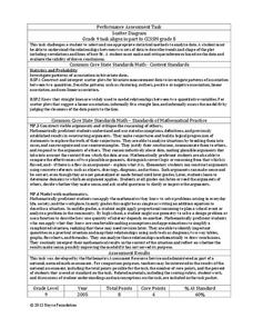
Scatter Diagram
It is positive that how one performs on the first test relates to their performance on the second test. The three-question assessment has class members read and analyze a scatter plot of test scores. They must determine whether...
University of Colorado
Using Spectral Data to Explore Saturn and Titan
Saturn's rings are made of dust, ice, and solid chunks of material. Individuals use spectrographs in this final installment of 22 lessons to determine the atmospheric elements. They analyze spectrums from Titan's atmosphere and Saturn's...
Fluence Learning
Writing About Informational Text: Political Parties
To demonstrate their ability to craft an analysis of informational text, class members read excerpts from James Madison's "The Federalist No. 10," from George Washington's Farewell Address, and from Thomas Jefferson's First Inaugural...
Balanced Assessment
Monitor Pricing
Out with the old and in with the new. Learners use a set of prices of computer monitors from 1994 to make a prediction. They then use one current price and what they know about the old prices to make a more recent prediction. Their...
US Department of Commerce
The New Normal
Don't be normal ... be exceptional in understanding statistics. Pupils analyze six different sets of census data using histograms or normal probability plots to determine whether each data set fits a normal distribution. They then get...


