Curated OER
Hopes and Dreams: A Spreadsheet Lesson Using Excel
Fourth graders read "The Far Away Drawer" by Harriet Diller and discuss the story as a class. After discussion, 4th graders create a t-shirt GLYPH about their hopes and dreams,share their information with the class and create spreadsheets.
Noyce Foundation
Ducklings
The class gets their mean and median all in a row with an assessment task that uses a population of ducklings to work with data displays and measures of central tendency. Pupils create a frequency chart and calculate the mean and median....
EngageNY
Informally Fitting a Line
Discover how trend lines can be useful in understanding relationships between variables with a lesson that covers how to informally fit a trend line to model a relationship given in a scatter plot. Scholars use the trend line to make...
University of Colorado
The Moons of Jupiter
Can you name the three planets with rings in our solar system? Everyone knows Saturn, many know Uranus, but most people are surprised to learn that Jupiter also has a ring. The third in a series of six teaches pupils what is around...
Curated OER
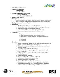
Science: Her-bariums Galore!
Young scholars collect and identify plant species and construct herbariums both at school and at home. By gathering data from both locales, they draw conclusions and make predictions about plant diversity. Upon completion of the...
University of North Carolina
Figures and Charts
Sometimes words aren't the best way to get information across to the reader. The eighth handout in the 24-part Writing the Paper series describes different type of figures and charts to display complex information in a paper....
University of Colorado
Happy Landings: A Splash or a Splat?
Huygens spacecraft landed on Saturn's moon Titan in 2005, making it the farthest landing from Earth ever made by a spacecraft. In this hands-on activity, the 12th installment of 22, groups explore how density affects speed. To do this,...
Curated OER
Changing Planet: The Warming of Our Large Lakes - Reasons for Concern
Another A+ instructional activity on the impact of climate change comes to you from the National Earth Science Teachers Association. In this installment, learners model the stratification of water in lakes due to temperature differences....
University of California
Hot! Hot! Hot!
Calories are not tiny creatures that sew your clothes tighter every night, but what are they? A science activity, presented at multiple levels, has learners experiment with heat, heat transfer, and graph the function over time. It also...
Curated OER
How Do You Rate?
Fifth graders make a graph. For this pulse rate lesson, 5th graders estimate their pulse and record it. Students measure their pulse while at rest and after physical activity and record it. Students use the internet to graph their...
Curated OER
Weather "Whys"
Students complete activities to explore fall weather. In this weather lesson, students use the given links to examine weather forecasts. Students complete a weather graph activity and watch Internet field trips. Students complete fall...
Curated OER
NFL Home Field Advantage?
Does the home team have the home field advantage in football? Class members look at a graph that displays wins at home and wins on the road for each NFL team from 2002–2012. Then they answer eight word problems that look at the...
Yummy Math
Deflate-gate
Does temperature affect the air pressure of a football? Young mathematicians look at the readings from a pressure gauge and determine if the balls are within regulation or are under inflated.
Science Matters
Slip Sliding Along
The San Andreas Fault is the largest earthquake-producing fault in California. In the seventh lesson in the 20 part series, pupils create maps of California, focusing on the San Andreas Fault system. The comparison of where California is...
Curated OER
Using Political Cartoons to Understand Historical Events
Examine historical perspectives through the use of political cartoons. Learners complete analysis activities related to the president's title, the establishment of the national bank, and the Jay Treaty.
National Geographic
Mapping the Shape of Everest
With Mount Everest as the motivator, your earth science class learns about topographic maps. Begin by showing a film clip from The Wildest Dream: Conquest of Everest, featuring fearsome virtual imagery of a path up world's tallest peak....
Illustrative Mathematics
Telling a Story With Graphs
Turn your algebra learners into meteorologists. High schoolers are given three graphs that contain information about the weather in Santa Rosa, California during the month of February, 2012. Graph one shows temperatures, graph two...
Curriculum Corner
“I Can” Common Core! 1st Grade Math
Any first grader can master the Common Core math standards with this checklist! With each standard rewritten as an affirmative I can statement, children are provide with clear goals to work toward throughout the school year.
Display an...
Smarter Balanced
Food Waste and Food Access
Forty percent of food in the US goes uneaten while 14.5 percent of US households lack a secure supply of food. As part of the preparation for a performance task assessment, groups consider statistics such as these about food waste and...
AIMS Education Foundation
Classroom Olympics
As the Summer Olympics are approaching, incorporate Olympic-type games into the classroom. From straw javelin to cotton ball shot put, these games are sure to keep leaners engaged. The best part is that there is math involved! Pupils...
Curated OER
The Great Turkey Walk
Students formulate questions that can be addressed with data and collect, organize, and display relevant data to answer them. They wcreate bar graphs and pie graphs
Curated OER
Circle the Earth - Explore Surface Types on a Journey around Earth
Students use CERES percent coverage surface data with a world map in locating landmasses and bodies of water at Earth's Equator.
Curated OER
Graphing Current Drug Data
Students increase understanding of the drug issue and further develop skill in graphing.
Curated OER
Monitoring an Epidemic: Analyzing Through Graphical Displays Factors Relating to the Spread of HIV/AIDS
Tenth graders differentiate pandemic and epidemic. In this health science lesson plan, 10th graders analyze how HIV and AIDS affect different countries. They construct and interpret different types of graphs.
Other popular searches
- Data Display
- Misleading Data Display
- Appropriate Data Display
- Graphs and Data Display
- Display Simple Data
- Analyze Data Displays
- Data Display Center
- Voluntary Data Display
- Best Data Display
- Rates and Data Display
- Simulation Data Display
- Ways to Display Data


