Curated OER
Sampling Bias And the California Recall
Using a 2002 California Gray David recall vote as an example, young statisticians identify sources of bias in samples and find ways of reducing and eliminating sampling bias. They consider ways to select random samples from a...
Curated OER
Chances Are......You're Right
Young mathematicians study probability. In this math lesson plan, learners calculate odds, and convert those into percentages of probability. Fractions are also used, making this lesson plan quite rich in some of the more difficult...
Curated OER
It Has Been Rubbish For Years
Students are presented with the problems of percentages and focus upon numbers in contrast to 100. They calculate problems with money and are engaged with the use of games as a teaching tool. Students also interpret data as presented in...
Alabama Department of Archives and History
A Worse Death: War or Flu?
In a lesson that integrates history and mathematics, class members create graphs that compare military death statistics from World War I with those that resulted from the influenza pandemic of 1918.
Curriculum Corner
7th Grade Math Common Core Checklist
With so many math standards to fit into a school year, it can be difficult keeping track of what you have and have not covered. This collection of Common Core checklists allows you to maintain a running record of when each standard was...
Curriculum Corner
8th Grade Math Common Core Checklist
Ensure your eighth graders get the most out of their math education with this series of Common Core checklists. Rewriting each standard as an "I can" statement, this resource helps teachers keep a record of when each standard was taught,...
Mathed Up!
Questionnaires
Check the appropriate box. Class members determine whether a questionnaire is an appropriate one. The portion of the General Certificate of Secondary Education math assessment review requires pupils to create a valid questionnaire to...
Curated OER
How Many?
Students investigate concepts related to data collection and interpretation. They generate all possible outcomes in a beginning study in the realm of statistics. The use of real life situations helps to engage students.
Curated OER
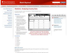
Analyzing Country Data
Students analyze different data in percentage form. In this statistics lesson plan, students plot data using box-plots, dotplot, and histogram. They compare and contrast the collected data using the boxplot.
Curated OER
Assessing Normalcy
Students define normal distribution as it relates to the bell curve. In this statistics lesson, students use the central tendencies of mean, median and mode to solve problems. They plot their data and draw conclusion from the graphs.
Curated OER
What is a P-value?
Learners test the hypotheses using p values. In this statistics lesson plan, students define and examine conditional probability. They test each statement for a true statement or a false statement, based on the sample size.
Curated OER
Vote for Me!
Tenth graders analyze voter trends in South Carolina and discover techniques canddidates and their parties use to convince us to vote their way. They are able to locate voting statistics for their county; compare the number of...
Curated OER
How to Make Histograms
Students collect data and plot it using a histogram. In this statistics lesson plan, students interpret histograms. They find the frequency, percents and density.
Curated OER
Boxplots Introduction
Students describe the pattern of a bell curve graph. In this statistics instructional activity, students move data around and make observation about the mean, and the quartiles. They define boxplot, outlier, range and other important...
Curated OER
Multiply Boxplots
Students identify the mean, quartiles and range of a boxplot. In this statistics lesson, students identify cooperative boxplot as it relates to the data. They make conjectures about students grade distribution.
Curated OER
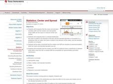
Center and Spread
Students collect and analyze data. In this statistics lesson, students define and calculate the range, median and standard deviation. They identify reasons for a skewed distribution.
Curated OER
Measure of Spread
Students identify the standard deviation. In this statistics lesson, students find the mean distribution and calculate the percent of deviation from the mean. They observe this change on the Ti calculator.
Curated OER
How Far is Far?
Learners calculate the standard deviation of data. In this statistics lesson plan, students collect data, plot it and analyze it. They identify the mean, median and range of their data.
Curated OER
Center of Mass
Pupils identify the geometric mean of their data. In this statistics lesson, students collect data and graph their findings. They identify the mean, range and mode.
Curated OER
Z-Scores
Students solve problems by identifying the percent of area under the curve. In this statistics lesson, students discuss z-scores as they calculate the different percentages under the bell curve. They calculate the standard deviation.
Curated OER
Normal Probability Plot
Young scholars analyze the graph of a distribution. For this statistics lesson, students define skewed or mound shape distribution as they investigate the data behind the graph. They define and plot outlier as well as normal probability.
Curated OER
Looking Normal
Students identify the shape of a function. For this statistics lesson, students plot the data collected. They analyze their data for positive, negative or no correlation. They find the line of best fit.
Curated OER
Percentiles
Students analyze the bell curve and make predictions. In this statistics lesson plan, students calculate the percentile to the left of the curve. They then are given the percentile and create the graph from the data.
Curated OER
Probability Distributions
Students collect and plot data on a graph. In this statistics instructional activity, students analyze the distribution of a sample and predict the outcome. They find the line of best fit and discuss what would make the sample larger.


