College Board
Evaluating Sources: How Credible Are They?
How can learners evaluate research sources for authority, accuracy, and credibility? By completing readings, discussions, and graphic organizers, scholars learn how to properly evaluate sources to find credible information. Additionally,...
OpenStax
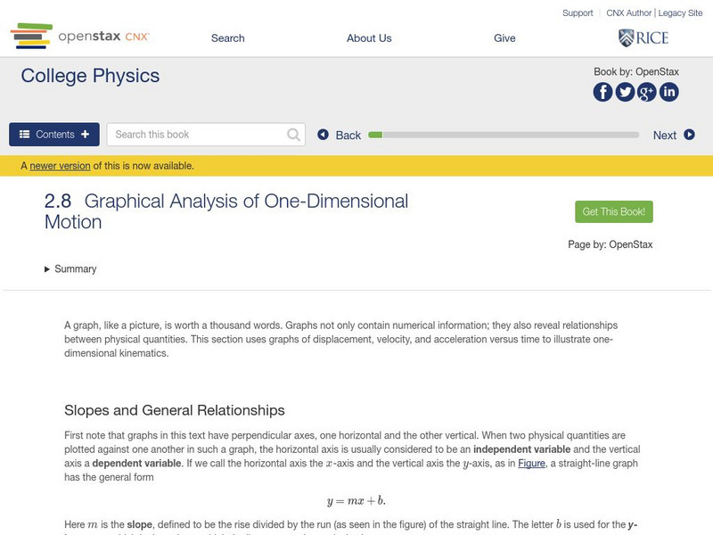
Open Stax: Graphical Analysis of One Dimensional Motion
In the following interactive module students will describe a straight-line graph in terms of its slope and y-intercept. They will determine average velocity or instantaneous velocity from a graph of position vs. time.
Sophia Learning
Sophia: Creating Graphic Organizers
This tutorial focuses on creating graphic organizers for a variety of purposes. It presents the following types of organizers, their uses, and the format of each: the Cornell method, charting method, cause and effect organizers, flow...
Science Buddies
Science Buddies: Interpreting Area Data From Maps vs. Graphs
Graphical methods of data presentation are a key feature of scientific communication. This project asks the question, "What's the best way to compare the land area of states: a map or a bar graph?" You'll be measuring performance on two...
PBS
Pbs Learning Media: Finch Beak Data Sheet [Pdf]
This graphic from Ecology and Evolution of Darwin's Finches by Peter Grant presents data from the Galapagos Islands, showing that a severe drought put selective pressure on the population of Darwin's finches and resulted in a change in...
Other
Bscs: Frog Eat Frog World
In this self-directed lesson, students will use maps and Frogwatch data to explore the natural and invasive range of the American bullfrog. A handout with everything the student needs to complete this lesson is available as a PDF or...
Daily Teaching Tools
Daily Teaching Tools: Customizable Graphic Organizers
This Daily Teaching Tools resource provides a series of graphic organizers for reading students. Forms are provided for plot, character analysis, reading logs, and reading responses.
Science Buddies
Science Buddies: An Experiment in Visual Perception
Graphical methods of data presentation are a key feature of scientific communication. This project will get you thinking about how to find the best way to communicate scientific information.
Annenberg Foundation
Annenberg Learner: Drawing a Box Plot
Learn how to represent the Five-Number Summary graphically using a box plot.
Better Lesson
Better Lesson: Collaborative Booktalk: Sharing and Writing Development
Are dark themes in young adult novels harmful or helpful to teens? Students will explore this question and will create an argumentative writing piece based on textual evidence. Videos of the lesson in action, examples of student work,...
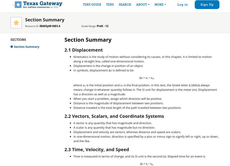
Texas Education Agency
Texas Gateway: Kinematics Section Summary
This is a summary of the main topics for AP Physics Chapter 2 Kinematics. These include Displacement; Vectors, Scalars, and Coordinate Systems; Time, Velocity, and Speed; Acceleration; Motion Equations for Constant Acceleration in One...
Department of Defense
Do Dea: Real Survival Skills
Learn about process analysis, writing procedurals texts, the steps of the writing process, and cause and effect in this unit. Also, examine patterns of organization in writing. A handy chart shows common organizational patterns which...
Shodor Education Foundation
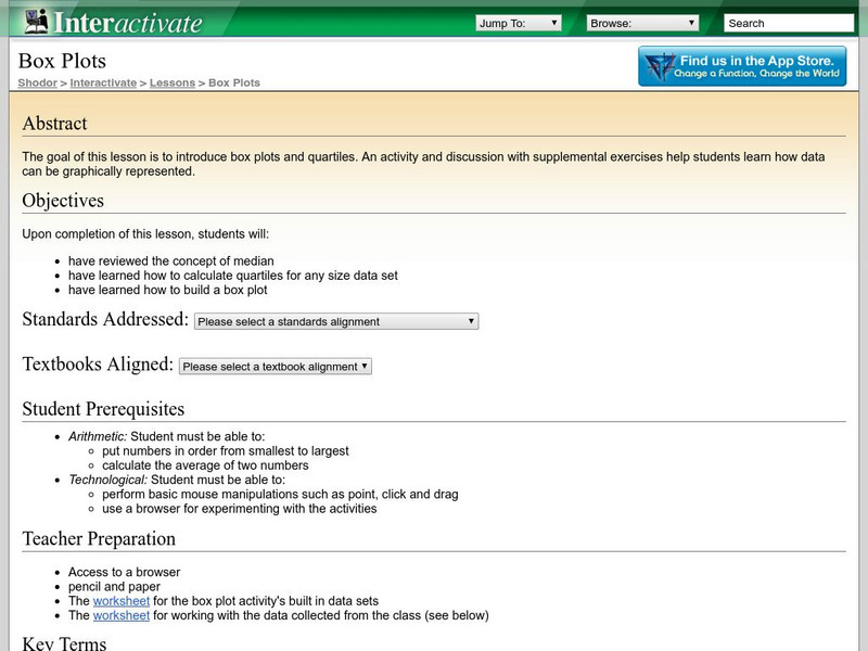
Shodor Interactivate: Lesson: Box Plots
This lesson plan introduces quartiles and box plots. It contains an activity and discussion. Supplemental activities about how students can represent data graphically are also included.
Polk Brothers Foundation Center for Urban Education at DePaul University
Depaul University: Center for Urban Education: Evaluate Decisions [Pdf]
A nonfiction graphic organizer is available to help students evaluate decisions of people. Students will analyze how characters interact and develop throughout the course of a nonfiction text.
University of North Carolina
University of North Carolina Writing Center Handouts: Statistics
When presenting an argument, the use of statistics to support a point can be very effective. This handout offers advice on both how to read statistics so that you understand exactly what they mean, and how to use them in your argument so...
National Endowment for the Humanities
Neh: Edsit Ement: I'm Gonna Sit Right Down and Write Someone a Letter
Through the vast online resources available from EDSITEment, students can read the correspondence of the famous, the infamous and the ordinary, some of whom lived through extraordinary times. Use these fascinating letters as a starting...
TeachEngineering
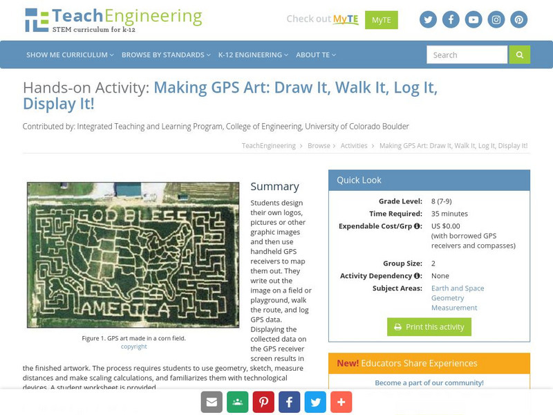
Teach Engineering: Gps Art
Students design their own logo or picture and use a handheld GPS receiver to map it out. They write out a word or graphic on a field or playground, walk the path, and log GPS data. The results display their "art" on their GPS receiver...
TeachEngineering
Teach Engineering: Ball Bounce Experiment
Many of today's popular sports are based around the use of a ball, yet none are completely alike. In fact they are all designed with specific characteristics in mind. Students will investigate different balls' abilities to bounce and...
Texas Instruments
Texas Instruments: Identifying Types of Correlation From a Graph and Calculator
Students will identify different types of correlations graphically and by using the linear regression analysis obtained from a TI-84 Plus calculator. Students will also obtain and know the significance of a correlation coefficient as a...
Khan Academy
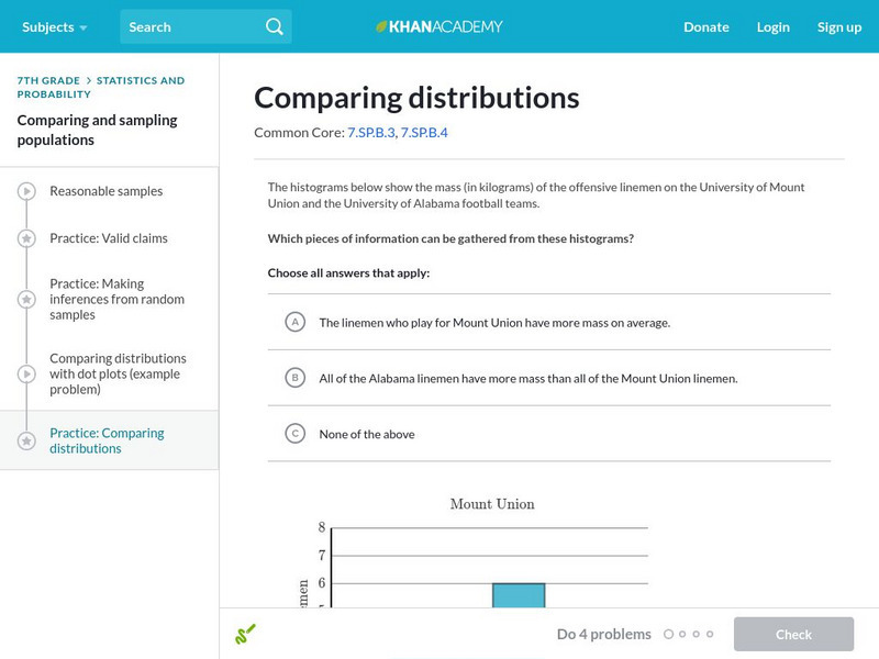
Khan Academy: Comparing Distributions
Practice comparing distributions of data in different forms of graphical representation.



![Pbs Learning Media: Finch Beak Data Sheet [Pdf] Website Pbs Learning Media: Finch Beak Data Sheet [Pdf] Website](https://content.lessonplanet.com/knovation/original/38853-54307de55e3ff0df41d67fbc6e061b4b.jpg?1661365772)


