ClassFlow
Class Flow: Analyzing Data Mean, Median and Mode
[Free Registration/Login Required] Explores ways of analyzing data in a table.
ClassFlow
Class Flow: Arrangements Handling Data
[Free Registration/Login Required] In this lesson students use counting strategies to determine all possible outcomes from an arrangement of different situations (e.g. the different ways to seat knights at King Arthur's table, different...
ClassFlow
Class Flow: Card Games Handling Data
[Free Registration/Login Required] This is a fun game using cards and challenging students to think of probabilities.
ClassFlow
Class Flow: Charts Handling Data
[Free Registration/Login Required] Reading graphs fit together with this engaging, colorful flipchart analyzing pie charts, bar graph, percents, and fractions.
ClassFlow
Class Flow: Collecting and Analyzing Data Using Pedometers
[Free Registration/Login Required] Students will collect and analyze data after wearing a pedometer. They will record data, make a personal bar graph and a class graph. Activotes are used to analyze and discuss the data.
ClassFlow
Class Flow: Cumulative Frequency Data Handling
[Free Registration/Login Required] Students draw conclusions and engage in tables and charts involving cumulative frequency; a wonderful review of student's knowledge.
ClassFlow
Class Flow: Donkey Derby Handling Data
[Free Registration/Login Required] Can you list all probabilities when two dice are thrown? Run your own race here and see which donkey wins.
ClassFlow
Class Flow: Making "Lunch Count" Count
[Free Registration/Login Required] Using real world data (lunch count) students are able to interpret and manipulate data. This lesson is usable by all elementary grades and possibly secondary as well. While it is based on Washington...
ClassFlow
Class Flow: Mode and Range
[Free Registration/Login Required] In this flipchart, students are introduced to two statistical concepts: mode and range.
Math Is Fun
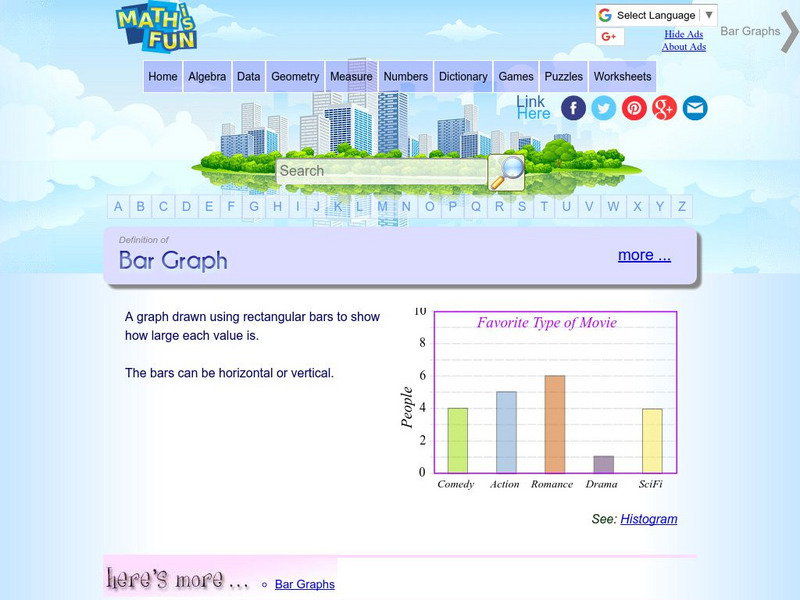
Math Is Fun: Definition of Bar Graph
Get the definition for a bar graph. Then, select the link "here's more" and use the interactive graph to display data as a bar graph, line graph or pie chart. The finished graph may be printed.
Sophia Learning
Sophia: Significant Figures: Multiplication & Division
A PowerPoint lesson reviewing rules for significant figures during multiplication and division. Students should have previous knowledge of significant figures. PowerPoint also gives several examples of the rules.
National Center for Ecological Analysis and Synthesis, University of California Santa Barbara
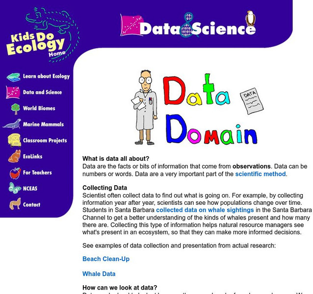
Nceas: What Are Data?
This site from NCEAS answers many questions about data. You can also learn about data, tables, and types of graphs in this informative site.
Sophia Learning
Sophia: What Are Pie Charts?
This lesson defines the phrase pie chart. Students can look at a presentation and then take an online quiz.
Purple Math
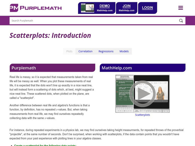
Purplemath: Scatterplots and Regressions
Explains the purpose of scatterplots, and demonstrates how to draw them.
BBC
Bbc: Standard Deviation
A demonstration of how to find the standard deviation of a set of data. Several examples and a practice test are offered.
Integrated Publishing
Integrated Publishing: The Communication Process
With text and diagrams, this article surveys the communication process, which consists of a message being sent and received, either verbally or nonverbally.
Songs for Teaching
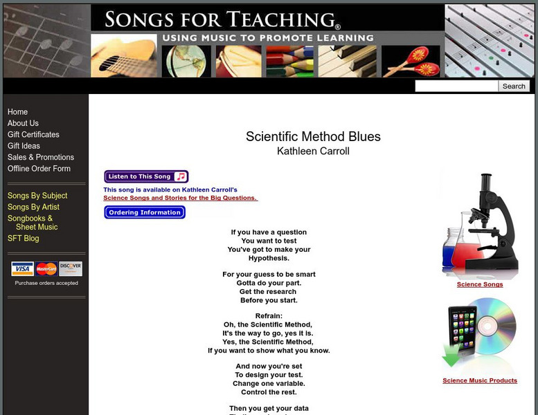
Songs for Teaching: Scientific Method Blues
This instructional activity introduces the scientific method to your students through song. Students will learn the steps of the scientific method through this great song written by Kathleen Carroll. Click on the link and play it for...
National Center for Ecological Analysis and Synthesis, University of California Santa Barbara
Nceas: Scientific Method
This concise site from NCEAS contains an explanation of the scientific method along with a basic example of the scientific method in action.
AAA Math
Aaa Math: Statistical Range Ii
Learn how to find the range of a set of data, and then follow up with some practice problems.


