Curated and Reviewed by
Lesson Planet
This Interpretation of Circle Graphs: Northwest Region Population Pie interactive also includes:
- Pie Chart
- Student Reference
- Join to access all included materials
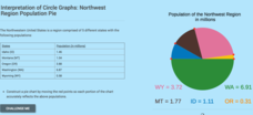
Given populations of the five Northwestern states, learners create a circle graph. Using the data and the pie chart, they make comparisons between the populations of the states. Finally, the pupils determine how the chart will change since the last census.
15 Views
16 Downloads
Additional Tags
Instructional Ideas
- Convert the populations counts into percents
- Lead a discussion on the pros and cons for rounding percentages when building a pie chart
Classroom Considerations
- The interactive displays population counts when changing the size of the sectors
Pros
- Includes hints for questions
- Displays the correct answer if users select the wrong one
Cons
- None


